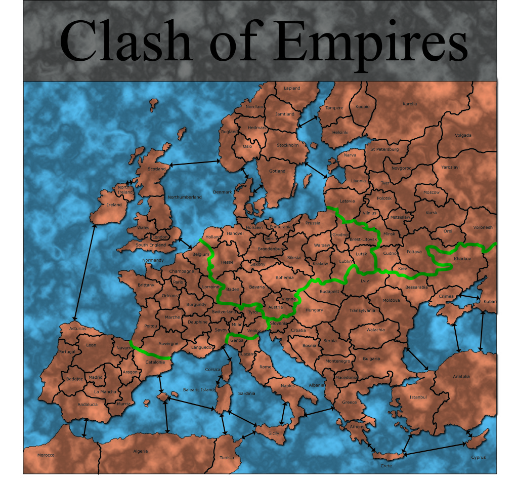
I made several visual changes to the map in order to address comments that it was difficult to read.
- Thicker borders.
- Larger territory labels.
- Arrows to represent connections over water
- Thick green borders to visualize sections of the map, which are blocked off based on the number of players.
